Category Archives: Uncategorized

Top 10 Lessons I’ve Learned About Designing Responsively

Week 9, Blog Post 7

Objective:

Identify the top 10 lessons learned in this class, Designing for Mobile Devices I, while working on my FlowerScapes.com web site project.

Top 10 Lessons I’ve Learned:

  1. First and foremost, I learned that you need to rethink the way you approach your workflow when designing responsively for mobile devices. The usual way of designing pixel perfect fixed width sites is over!  You must be able to make the site viewable for many different screen sizes.
  2. Whether your designing responsively or for fixed width desktop sites, it is best to always sketch your design out on a paper “sketch sheet” first, before proceeding to digitally design your mockups. I found this to be very helpful when designing my mockups. It made the digital layout go much faster. I found some sketch sheets that I downloaded for free which I used to create my sketches.
  3. I learned how important it is to REALLY know your content, and that you MUST start ANY responsive design with a strategy on how that content will layout and flow from device to device. I found this to be one the most challenging aspects, because it’s like trying to fit 10lbs. of sugar into a 5lb. bag!  I spent quite a bit of time just starring at my original desktop version sketch sheet and having to think really hard about how I was going to fit ALL that information into a smaller mobile layout without sacrificing any of the information.
  4. I also learned a great method for arranging and categorizing your content without having any visuals in the way and BEFORE actually mocking anything up, through the use of a “Content Survey” sheet. I’m working on creating one of my own based on one that I found online.
  5. There are many online tools you can use to do your mockups, prototypes and site building using flexible grid layouts. You have to be careful using some of these however, because they carry a lot of extraneous code along with them. The one I think I’m really going to like is Skeleton because it’s bare bones. I’ve listed its link as well as some others, and they are definitely worth bookmarking:
    http://goldengridsystem.com/
    http://simplegrid.info/
    http://www.columnal.com/
    https://gridsetapp.com/
    http://www.getskeleton.com/
  6. I learned about some javascript plugins that can be used to make your site cross-browser compliant, such as Categorizr, which can be found at
    http://www.brettjankord.com/2012/01/16/categorizr-a-modern-device-detection-script/
  7. I learned about using location detection and motion detection mobile capabilities such as accelerometers, which are usually accompanied by a compass, and that when using the “geolocation” feature you must use javascript to make that feature work, such as the Modernizr javascript jQuery library.
  8. I learned about using “polyfills”, which is a piece of code or plugin that provides the technology that some browsers lack in order to make your sites more responsive and adaptable to many different screen environments.
  9. I have learned about testing your responsive design, and have visited and bookmarked many sites which help you accomplish this. Because, although you can simply minimize and maximize your browser window to test whether your site it reflowing as it should, this method DOES NOT test for the functionality of your site. Here are some of the web sites I have read over and bookmarked for future use on testing my responsive sites:

    http://www.benjaminkeen.com/open-source-projects/smaller-projects/responsive-design-bookmarklet/
    http://responsinator.com/
    http://responsive.is/desolve.com
    http://screenqueri.es/
    http://mobitest.akamai.com/m/index.cgi

  10. I learned about using “microformats” within my HTML as a way of extending my content and giving it more semantic meaning. They also make your code more searchable. You can find the microformats site at http://www.schema.org. This site contains the schema vocabulary, as well as the microdata format information that you add to your HTML. This site is definitely a MUST READ!

Leave a comment

Filed under Uncategorized

Design Finalization Process of FlowerScapes.com

Blog Post 6: Finalize Design

Objective:

Write a 200-300 word progress report o your final project. Be honest in my writing. Indicate the true state of my progress. State what steps I have left to complete and my proposed timeline for commpleting the steps.

What I Have Completed:

  • I have completed a Home page and secondary page (Garden Center) for my FlowerScapes website, both in desktop and mobile screen sizes.
  • I have emailed the mockups to my Instructor at The Art Institute of Ft. Worth, Ms. Pamela Van Hook.
  • In the mockup process, I have gone through my artwork and saved the images both for mobile and desktop sizes.
  • I have done the math on the pixel to percentage/em measurements for all my divs/containers and my images.
  • I have researched and downloaded some javascript/jQuery files for my modal dialogue boxes and dropdown menus for the mobile version.
  • I have determined what fonts I will use for my site, on both the headers and body copy. They are Delius Regular for the headers and the Josefin font famiy for the body copy.

What I Need To Complete:

  • I still need to view about a weeks worth of video tutorials on Lynda.com learning how to set up and hand code a responsive site. This includes learning more about CSS3 and the new HTML5 tags in order to make my site more responsive.
  • I still need to setup my HTML5 index.html file and do the initial layout so that I will have a template for my other pages for both the mobile and desktop versions.
  • I still need to write CSS styles and save those in an external stylesheet.css file.

The timeline for submission of a final 10 page site is June 8, 2013.

Leave a comment

Filed under Uncategorized

Website Mockups for Mobile and Desktop Design

Blog Post 5: Website Mockups

Objective:

Design mockup screens (a home page and secondary page) for both a mobile version and desktop version of my FlowerScapes.com website. I will use this blog post to discuss the preparation and process of creating mockups for these versions.

Mockup Research

Although I’m considerably late in getting this blog post out, I thought it more important to be thorough in my research and learning process before I simply rushed to get something out.

One of THE MOST important things I learned is that the days of ONLY designing for the desktop are over!  A web designer today MUST learn to design for not only desktop screen sizes, but for tablet and cell phone screen sizes, as well as every screen size in between. This is what designing ‘responsively’ is all about. It’s about making your sites accessible for just about every kind of device and user it might encounter.

In preparation for building my desktop and mobile mockups for my FlowerScapes website, I first had to educate myself on exactly what responsive design is and how to build for it. I have viewed weeks of video tutorials on responsive design and the process of making your images responsive, as well as reading many articles and visiting some of the many resource websites out there. And I’m just touching the surface! There is so  much more to learn!

Designing responsively means that you have to drastically rethink your workflow. One of the most time-consuming things I encountered was moving from Photoshop and InDesign to Illustrator for designing mockups for responsive sites. The reasoning behind this is because Illustrator offers working with multiple artboards as well as features for exporting assets that Photoshop just doesn’t offer.I even learned about several javascript workarounds so that browsers will request, retrieve, and deliver the correct image size for the correct version of the site, whether it be for desktop, tablet or mobile.

Process of Creating Mockups for Responsive and Mobile Sites

I realize thus far in this blog I’ve not mentioned designing “mobile” as much as I’ve mentioned designing “responsively”. That’s because in order to design for mobile you MUST know how to design responsively first. Following are the steps I took in designing my mockups for both the mobile and desktop versions of my Home page and Garden Center page.

  1.  First and foremost, I researched, researched, and then researched again on the topic of designing for mobile devices.
  2. Learned to gather content FIRST, then organize it into categories for both the desktop and mobile versions, which were drastically different from one to the other.
  3. I learned that I should sketch out on PAPER my design first! So I found some web sketch sheets online and downloaded those, printed them out and penciled my wireframes first. I found this extremely helpful, as I had initially started designing my mockups in Photoshop. But once it was suggested that I do the pencil to paper method instead, I found by doing that made the entire process much faster when setting down to design my mockups in Illustrator. I also learned that you should ALWAYS start with your mobile version FIRST. That was very helpful.
  4. Within Illustrator I setup a document that contains 4 artboards:
  • one for the mobile “Home” page set to 320 pixels wide x 480 pixels tall, which is the iPhone’s SCREEN size;
  • one for the desktop “Home” page set to 960 pixels wide x 1150 pixels tall;
  • another for the mobile secondary page (Garden Center);
  • and lastly, one for the desktop version of the secondary Garden Center page.
5.   Once I had the mockups designed, I exported them, as separate artboards, from Illustrator to individual PNG’s.

Things I learned about designing responsively

  • how to control viewports
  • how to set media queries
  • how to set breakpoints within my media queries in order to make the site flex from a desktop version to a mobile version.
  • how to size my images for higher density screens and when to consider using high resolution images based upon screen sizes.
  • how to use javascript plugins to query a request for images and let it decide which image to retrieve based on screen sizes.
  • I learned about hardware pixels versus reference pixels (sometimes referred to as CSS pixels).
  • I learned that I can indeed use Google web fonts on my mobile site.
  • how to use the new HTML5 elements to make my sites more accessible to screen readers. I even found a website that lets you test using a aural screen reader… very cool!
  • I learned about controlling the box model size using percentages and em’s and exactly how to do the math on converting pixels to em.

Leave a comment

Filed under Uncategorized

Website Comparison

Objective:

Using one of the sites I researched for Blog Post 1, write a more in-depth analysis of the differences and similarities between the mobile and desktop versions of the website.

In expanding further on the similarities and differences between Lynda.com mobile and desktop versions, I will refrain from regurgitating the same information as I did in blog 1, but rather delve deeper into some of those things mentioned in blog 1, as well as discuss some other differences I noticed between the 2 versions:

Key differences between the lynda.com desktop version versus the mobile version:

  • On the mobile version, all on the same line at the very top is the logo (left), followed by a “sign up” and “login” link. Just beneath that on the mobile version is a very prominent “Search” bar followed by the main horizontal navigation which includes a “Home”, “Subject”, “Software”, “Author”, and “New” buttons.
  • On the desktop version, all on the same line at the very top is a “Become a member” link, followed by the “Products”, “New Courses”, “Support”, “Subscribe”, “Reactivate”, and “Login” links. Just beneath that, all on the same line, is the logo (left), the “Subject”, “Software”, and “Author” links, and the “Search” bar.

Focusing on my comments above, you can see in the 2 diagrams below, the 2 versions vary quite a bit. I tend to like the way the desktop version’s home page defaults to the “All” category which lists all of the “New Courses” first. You’ll note that this “New” category within the mobile version was in the main navigation, for there is no “All” category on the mobile version. Beside the “All” category on the desktop version, there are buttons breaking the “New Courses” down further into specific categories, such as Photography, Video, Web, etc.

On the mobile versions Home Page, I really like the “About lynda.com: Who we are” video that appears at the top of the page. This video captures the essence of what Lynda.com is all about. It almost seems as though the mobile versions home page is geared toward people who perhaps have never visited the site before, whether on desktop or mobile.

  • The URL’s are different for each site. In the URL for the mobile site there is an “m” that comes first, followed by .lynda.com….  This “m” indicates that this is a mobile URL.
  • At the bottom of each of the versions there is an area that lists numerous menus, however,  the information from version to version is drastically different. On the mobile version it actually lists a couple of features that are specific to mobile environments, such as the “Full Site” and “Mobile Site Feedback” options.
  • I had to do a little searching on the desktop version to find the “Contact” button, which is listed under the “Support” dropdown menu at the top of the page. In contrast, the “Contact” button is clearly visible at the bottom of the page on the mobile version.

Key Similarities between the lynda.com desktop version versus the mobile version:

  • Each site offers a prominent “Search” bar at the top and bottom of each page.
  • Each site displays the main navigation at the top of each page.
  • Each site uses the same color scheme and fonts.

Leave a comment

Filed under Uncategorized

Design Document for FlowerScapes.com

In this blog I write about a school project I was given for my “Design For Mobile Devices” class I attend at The Art Institute of Fort Worth. My objective in this blog is to identify a web site that I will build for my final project and to write a description of the content, such as colors, fonts, graphics, etc., that I will be using for my site. I will be as detailed as possible, although I’m sure I will think of something later that I didn’t think about putting in this writing… seems to be the way it always goes!

FlowerScapes.com

For my final project I have chosen to build a web site for a Floral Nursery (FlowerScapes.com), which will offer online sales for delivery within a limited radius of its brick and mortar location, as well as architectural landscaping. In the following paragraphs I will describe how I will approach this site, and give details on the content.

Colors

For my color scheme I have chosen bright colors that are indicative of spring flowers. I have used http://www.colorschemedesigner.com to compose my triad of colors. Below is a screenshot showing my chosen colors.

colorScheme

Fonts

I will link to Google Web Fonts using the following fonts:

LogoFontBigelowRules

LogoTaglineFontYellowtail

HeaderFontDeliusBig

BodyFontDeliusSmall

Logo

This is my logo I created in Adobe Illustrator, which uses the above mentioned fonts.  I have outlined the fonts within the logo below, but on the actual site I will use absolute positioning on the logo text and tagline for accessibility purposes. It will be HTML5 compliant and screen reader friendly.

LogoFontsOutlined

Images

I plan on going to the Ft. Worth Botanical Gardens to shoot pictures for use on my web site. I intend on using a facebook icon and perhaps a twitter (not sure about that one yet) icon on the site. The shopping “basket” will be an image of a flower basket (maybe)… I have to see how that looks when I do my mockups.

Conclusion

I’m excited to get started on building my site. But even as I conclude this blog I’m already considering the possibility of taking the “.com” off the name and simply using “FlowerScapes” as the title (of course the URL will be flowerscapes.com). It seems as though I’ve fallen into a rut about naming my web sites ending in a “.com” within the logo design. Perhaps this time I’ll do away with this redundant practice. Any thoughts? I’d love some feedback on that one!

Leave a comment

Filed under Uncategorized

Responsive Web Site Design

Objective:

Find and read 3 online articles about responsive web site design. For each article, provide the complete citation (using American Psychological Association (APA) format) and a 75-100 word summary of the key points of each article.

Article 1

I chose to review this article first because it goes in-depth, especially about media-queries, about planning and designing a responsive web site. Following are some key points that this articles makes:

  • The author discusses how Mobile browsing is expected to outpace desktop-based browsing within three to five years.
  • He mentions how more and more of his clients are specifically requesting “iPhone websites”, and credits this request mostly to mobile WebKit’s quality as a browser.
  • The author talks about CSS “media types” and how they were designed to target a specific class of web-ready device, but that most browsers didn’t support all of them and thus many times they were implemented poorly. He also discusses “media queries” and how they are more friendy in tageting many different devices, and he goes in depth and gives specific coding examples for various situations from scaling images and text in responsive design, as well as going from a multi-column layout to a single-column layout.
  • One last tip the author gave which I found worth mentioning is that you may download a jQuery plugin (http://plugins.jquery.com/project/MediaQueries) from 2007 which offers somewhat limited media query support (min-width and max-width) to support older browsers.

Citation:

Author, Ethan Marcotte, A List Apart (May 25, 2010). Responsive Web Design.

An A List Apart Article, issue number 306, pages 1-11. Retrieved from

A Primer on Responsive Design

Article 2

I chose this article because it gives some important points and tips for not only designing for a responsive web site, but also emphasizes site architecture based on content being the most important asset and how to design responsively based on the “context” of your device. Here are some key points the author makes:

  • The author states, “Responsive design is about putting the right content in users’ hands according to the context of their interaction.”  This couldn’t more true! He discusses content strategy that will guide to deliver ONLY what is necessary at the appropriate points in the user’s journey based on the users’ device.
  • Some of the tips he gives for designing responsively are to:
    1. Plan for a responsive design at the very beginning of the design process in order to adapt to future changes and browser compatibility.
    2. Start design with the smallest device in mind FIRST and then scale up from there.
    3. Focus on designing for the “key-content” based on the users’ device so that ONLY the most important content will be displayed for the smaller screens.
    4. Always make sure the lines of COMMUNICATION are flowing between the front-end and the back-end, and to do frequent testing for the delivery methods of content.

Citation:

Author, Kevin Stakem, Lindy Roux, Matt Holland  (June 12, 2012). A Primer on Responsive Design: From Content to Development.

UX Magazine, article number 837, pages 1-6. Retrieved from

A Primer on Responsive Design

Article 3

I chose this article because of its’ title, Responsive Design – What Is So Responsive About It?  But after reading it I found it didn’t offer any ‘new’ information but rather regergitated from other articles. However, it did make a couple of great points that I never really gave second thought to. They are as follows:

  • How laptops have been devoured by tablets and mobile phones due to the sheer accessibility and convienence of the mobile device; and
  • that most mobile and tablet users never tend to think about how much work a web designer has to go through in order for their pages to display and function properly for the mobile device they may be using.

Citation:

Author, Kartik Mehta, (April 11, 2013). Responsive Design – What Is So Responsive About It?

Ezine articles,  page 1. Retrieved from

http://ezinearticles.com/?Responsive-Design—What-Is-So-Responsive-About-It?&id=7626880

Leave a comment

Filed under Uncategorized

Mobile versus Desktop Web Sites

Objective:

Review 3 company websites on a PC or Mac plus the mobile version of each website. List the folowing information, for each company, in your blog post.

  • Name of company
  • URL for desktop web site
  • URL for mobile web site (if different)
  • Key diferences between the site versions (design, color, page layout, categories, content).
  • Key similarities between the site versioins (same sample categories for differences)

Results of My Research:

In my research on how mobile web sites differ from desktop web sites, I gained much insight on the multitude of additional questions I need to consider from the user’s point of view than I would have ever thought to ask when designing for a desktop web site.

First and foremost, just the fact that a user is in a mobile state changes the way they access and consume information from the web. I never really gave it much thought before now, but that’s really very important!

The 3 web sites I chose to do my blog on are listed below. I chose these particular sites because I use each one of them on my desktop but never on my mobile cell phone. So I thought it would be interesting to see their differences between desktop and mobile.

  1. http://www.ehow.com
  2. http://www.amazon.com
  3. http://www.lynda.com

I will begin with ehow.com and explain the key differences between the mobile version versus the desktop version.

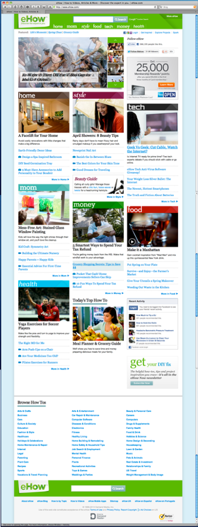
Below are screenshots of both the desktop version and mobile version of the ehow.com sites. Beneath the screenshots I discuss some key differences and key similarities between the 2 site versions.

 Desktop version of ehow.com – URL: http://www.ehow.com/
Image
 Mobile version of ehow.com – URL: http://www.ehow.com/
Image
Key differences between the desktop and mobile versions of ehow.com:
  • The main navigation is located in different areas of each version of the site.
  • The color on the main navigation buttons within the desktop version are using white text on a green background, whereas on the mobile version the main nav uses large clickable colored buttons for each category, with each lying on a different colored background.
  • On the desktop version, for each main nav category it also shows (beneath the slideshow at the top of the page) featured articles for those categories again with each category using a picture, a link to an article that is relevant to the subject matter, and clickable sub-category links leading the user to related articles, information and tips.   Whereas on the mobile version the layout is much narrower and only shows an area titled “Browse Categories” which have these topics listed beneath vertically as clickable text links using blue text on a white background.
  • The layout of the page is much wider on the desktop version.
  • The image slide show at the top of the desktop site is set to automatically fade from one picture to another, whereas in the mobile version the user has to manually swipe your finger from one picture to another to view them.
 Key similarities between the desktop and mobile versions of ehow.com:
  • Each site seems to offer the same content.
  • Each site offers a “Search” area at both the top and bottom of each site.
  • The URL’s are the same for both versions of the site.
  • Each site uses the same color scheme.

Now let’s take a look at the Amazon.com desktop and mobile versions.

 Desktop version of amazon.com – URL: http://www.amazon.com

 Image
 Mobile version of amazon.com – URL: http://www.amazon.com/gp/aw/h.html
Image
Key differences between the desktop and mobile versions of amazon.com:
  • The desktop layout is much wider than is the mobile version, and each site subtley uses different colors.
  • The main navigation categories on the desktop version are at the top of the page above the slide show, whereas on the mobile version the main navigation categories are displayed as a list of clickable text links found beneath the slide show.
  • The “Your Account” button is listed at the very top of the page on the desktop version, whereas on the mobile version you have to scroll down about halfway to access it.
  • On the desktop version there are advertising links running down the right side of the page, whereas on the mobile version there are none.
  • On the mobile version at the bottom of the page they offer an “Amazon.com Full Site” link, whereas the desktop version does not offer a link to the mobile version.
  • The desktop version shows your “Recent History” of recently viewed items; the desktop version does not offer this.
  • The desktop version offers related links to other sites; the mobile version does not.
  • The URL’s are different for each site.
Key similarities between the desktop and mobile versions of amazon.com:
  • Each site has a prominent “Search” bar at the top ONLY.
  • Each site is advertising the same products within a slide show at the top of the home page.
  • The slide show at the top of each site’s home page is one in which you manually have to swipe to see the next image.
  • Each site uses the same fonts.

Now let’s take a look at the Lynda.com desktop and mobile versions.

Desktop version of Lynda.com – URL: http://www.lynda.com

lyndaDesktop

Mobile version of Lynda.com – URL: m.lynda.com/?rp=http://www.lynda.com/

lyndaMobile

Key differences between the desktop and mobile versions of amazon.com:
  • The mobile version has a video at the top of the page just beneath the main nav titled “About lynda.com: Who we are”; the desktop version does not, it simply has a picture at the top of the page.
  • The URL’s are different for each site.
  • On the desktop version the “log in” button is at the top right of the page; on the mobile version it is located beneath the video at the top of the page.
  • On the desktop version you’re offered 4 types of subscriptions: “Individual Memberships”, “Business”, “School”, “Government”. The mobile version only offers a “Subscribe” button, and when clicked on it still does not offer the same categories as the desktop version.
  • The desktop version layout is much wider than is the mobile version; 2 completely different layouts.
  • The desktop version offers more information than does the mobile version.
Key similarities between the desktop and mobile versions of amazon.com:
  • Each site offers a prominent “Search” bar at the top of each page.
  • Each site displays the main navigation at the top of each page.
  • Each site uses the same color scheme and fonts.

Leave a comment

Filed under Uncategorized

Progress Update on Midterm Exam for Recipe Website

logo

As I sat down at my computer to begin on the midterm exam for the recipe website I was assigned to create for my Front End Designer Studio class, I noticed that I had been handed this assignment once before in previous class. So what I did was to take the original site I developed for the previous class, manipulate it and make it even better than before.

Looking back at the previous site, I noticed some areas of the web pages that were not up to speed and working properly. The following are some of the fixes and improvements I made:

  • On the overall layout of the entire site, I manipulated the page container background image, thereby enhancing the overlying image of the “world” which can now be seen more prominently in the upper right-hand corner.
  • On the main navigation for the site, the drop down menu on the “Recipes” link was not working properly, so I corrected that.
  •  I changed the logo font.
  • I changed the header font and broke that text into 2 lines.
  • I changed the navigation font to match the header font.
  • On the “Home” page, the “previous” and “next” buttons on the photo slideshow were missing their links, so I corrected that.
  • On the “Bran Muffins” page of the previous site, the wrong image was being used. I inserted the corrected image to now reflect an image of bran muffins, instead of the fudge cookies image.

There is one thing that is still not working properly on the rework of the site, though. With the exception of the “Home” page, the rollover state of the submenus within the “Recipes” dropdown menu are being obstructed by the body text on each of those recipe pages. The only logical reason for the obstruction happening, that I can think of, must have something to do with that body text on those particular recipe pages containing unordered list items, whereas the “Home” page body text uses a regular paragraph tag. Any feedback on this issue would be appreciated.

Leave a comment

Filed under Uncategorized

SuzyCakes Website Prototype Review

SuzyCakesLogo

Our prototype for the SuzyCakes.com specialty cupcake bakery website is moving right along!  After having received feedback from our client Suzy on the wireframe mockups we presented to her a couple of weeks ago, we have incorporated her suggestions into the prototype. We presented this prototype to her last week and the following is a list of suggestions that we will now incorporate into the site.

  • tone down the bright pastel colors a bit;
  • move the vertical “Order” banner to the right some, away from the phone number;
  • change the color of the Order banner to green;
  • incorporate the threads on the Order banner into the Home page storefront photo;
  • and use the same footer “wave” art behind the main navigation for the site.

I believe all of the suggestions and feedback on the prototype were helpful in bringing balance to the sites’ overall template interface. We have already begun to incorporate these changes into the site design and will meet with our client on March 16th for a final review. At this meeting, we should receive the body copy and images from Suzy that she would like to use in the final design. Although, my concern is that Suzy should have already submitted these assets to us at the time of the prototype review. That way we could have the assets placed into the site for our final review meeting on March 16th.  The site should be up and running by March 23rd, and with the late submission of these assets I’m afraid we may be running a week behind, as the site should be up and running by March 23rd.

Leave a comment

Filed under Uncategorized

Client Interview — Feedback, Comments, and Concerns

My business partner Mark and I met last week with Susie, a perspective web design client, to discuss building a website for her new specialty cupcake bakery she will be opening in Flower Mound, Texas. In this blog I will discuss some of the information Mark and I gathered from Susie, along with some our concerns about taking her on as a client.

General Information:

  • She does not currently have a website.
  • Bakery will serve specialty cupcakes, milk and gourmet coffee.
  • Bakery will be located next to a community college (potentially alot of foot traffic from students and faculty).
  • Target audience will be “everyone” – she wasn’t real clear on this.
  • When Googling “cupcake bakeries in Flower Mound, Texas”, I found that Susie will potentially have some competition. There are at least 3 bakeries in Flower Mound:
    • 8th Wonder Cupcakes;
    • Flower Mound Cakes; and
    • Swirl Bakery

Technical Functionality of Site:

  • Only needs the site in the English.
  • She wasn’t sure if she wanted a mobile version of her site, but Mark and I highly suggested that she have one due to the fact that she wants to market to everyone and should not limit her customer’s communication resources.
  • Most important to Susie about her site is that it use colorful pinks, contain lots of pictures of her cupcakes, and that the user be able to order online.
  • Of least importance to her were videos, animations, audio, and moving parts; she says that is very distracting.
  • When asked about her budget for the site, she suggested that we do it for free.
  • Susie is looking to open up her brick and mortar bakery around late March or early April of 2013.

Client’s Content and Extended Needs:

  • Images and Photos: Susie said she will take pictures for her site, but that we could use stock photography if need be. We suggested that she use a professional food photographer to get the best results in her photos.
  • Logo — Susie does have a logo that she will be emailing to us. She may want it redesigned.
  • Colors — Wants to use pinks and the colors of the rainbow.
  • Text Content — Susie will provide typewritten content for the body copy, menus with detailed descriptions and pricing in Microsoft Works file format.
  • Maintenance — Susie will need someone to maintain her site.
  • eCommerce — Will be an eCommerce site offering online ordering using a contact form.
  • She was not interested in any other special features such as a blog, a login area, or a discussion forum. 
  • Printed Collateral — Susie will be needing some printed collateral such as flyers and marketing ads.
  • Photo Gallery — Susie wants a photo gallery on her site with the user being able to click to enlarge image with detailed description of product.
  • Google Maps — Susie wants a link to Google Maps on her site.


Comments and Concerns

While meeting with Susie, I found her to be very frustrated with the informational questions that Mark and I were asking of her. It seemed as though she hadn’t thought her website ‘plan’ through, but then again, that’s why she called us!  Perhaps Mark and I should have taken a different approach and portrayed a bit more excitement about Susie’s new business.

I will take what I have learned from this client interview and improve upon my communication skills and be more aware of my client’s mood, characteristics, and personality.

Leave a comment

Filed under Uncategorized